Websites Look the Same
Have you noticed it? almost every site we visit today follows a very similar design. Sure, they change the colors and the fonts, but overall they are the same.
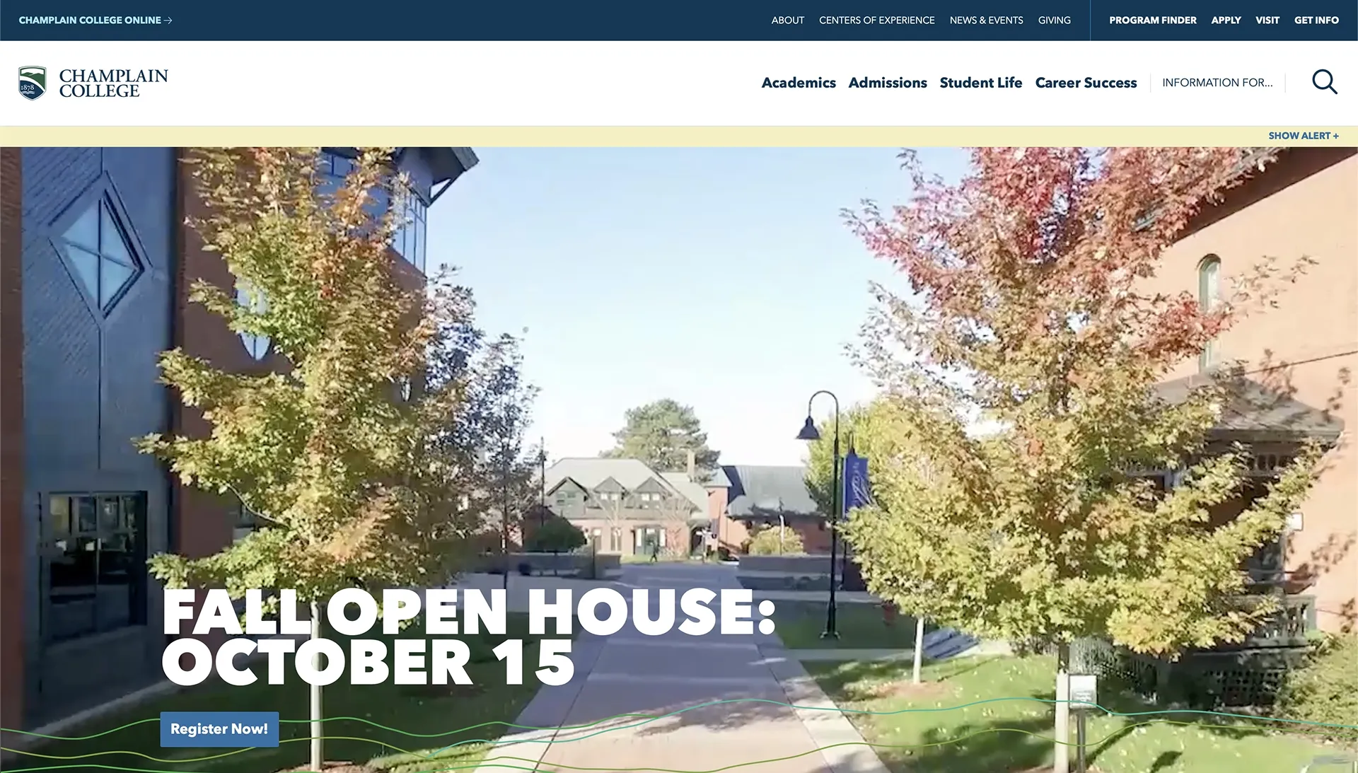
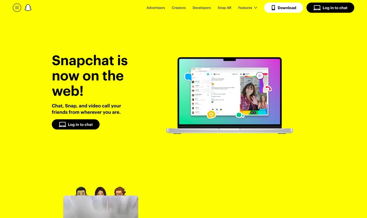
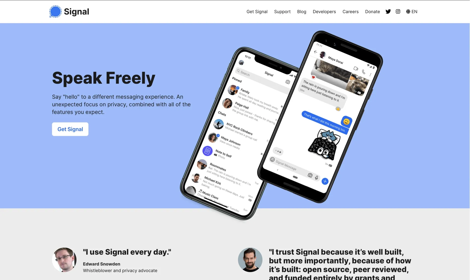
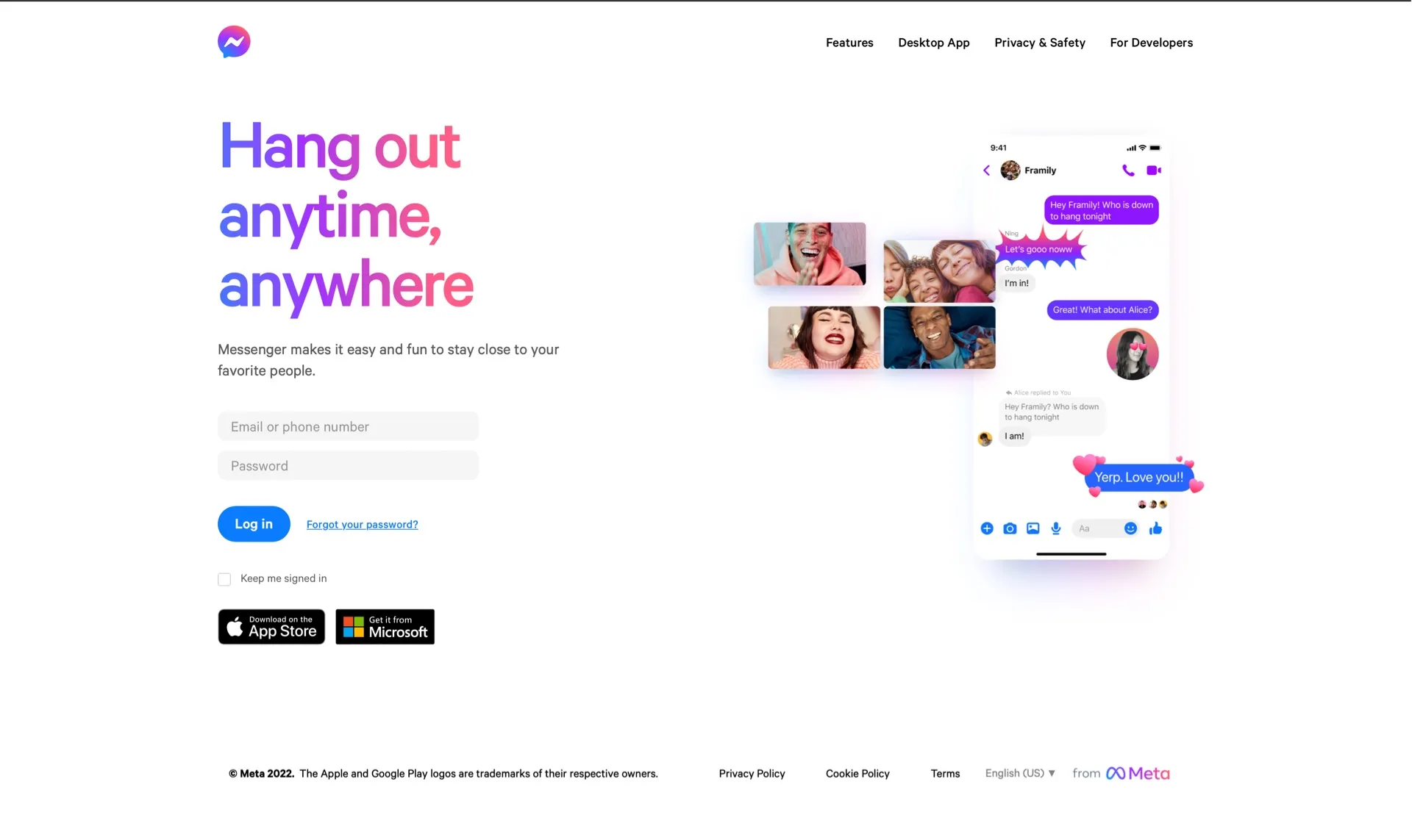
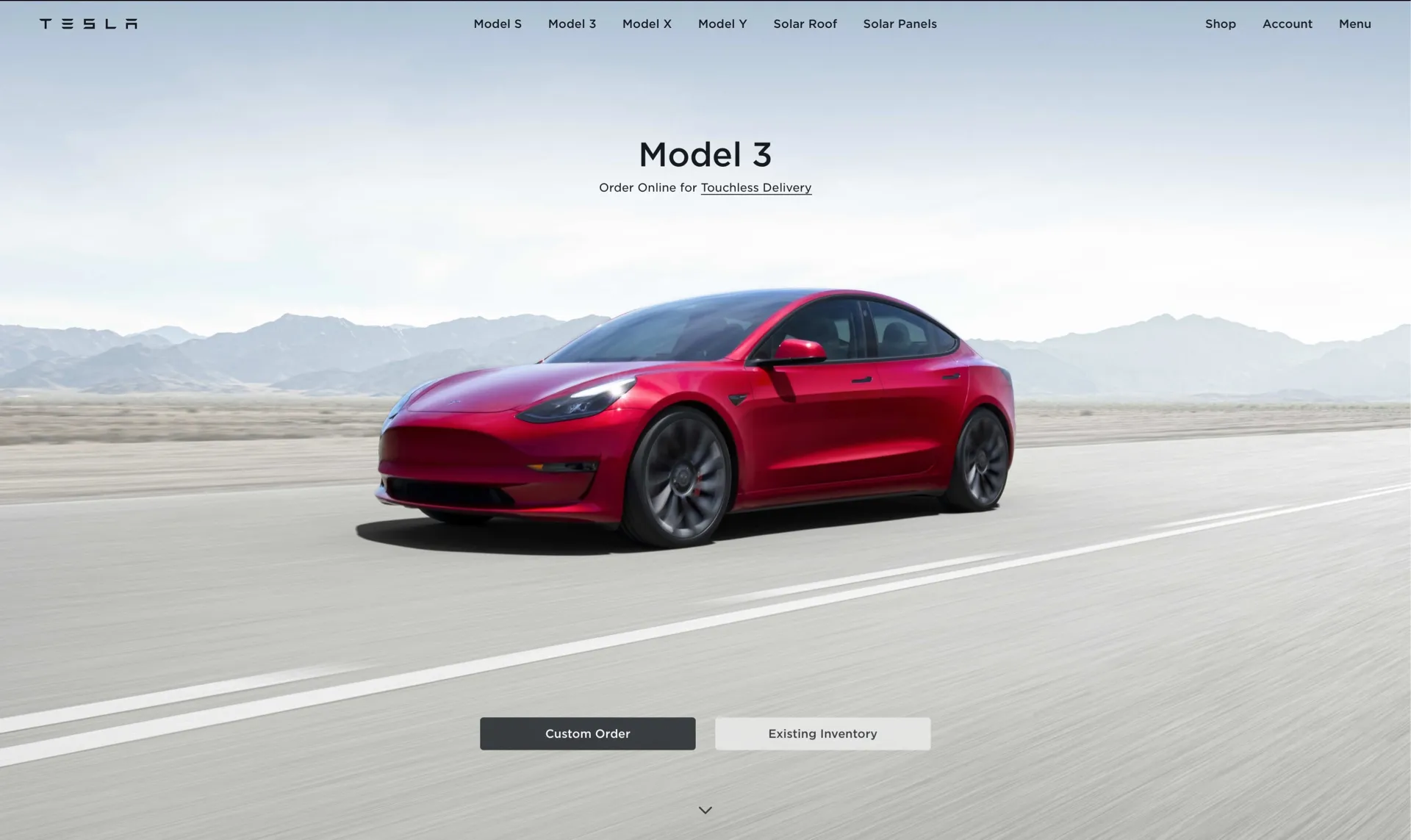
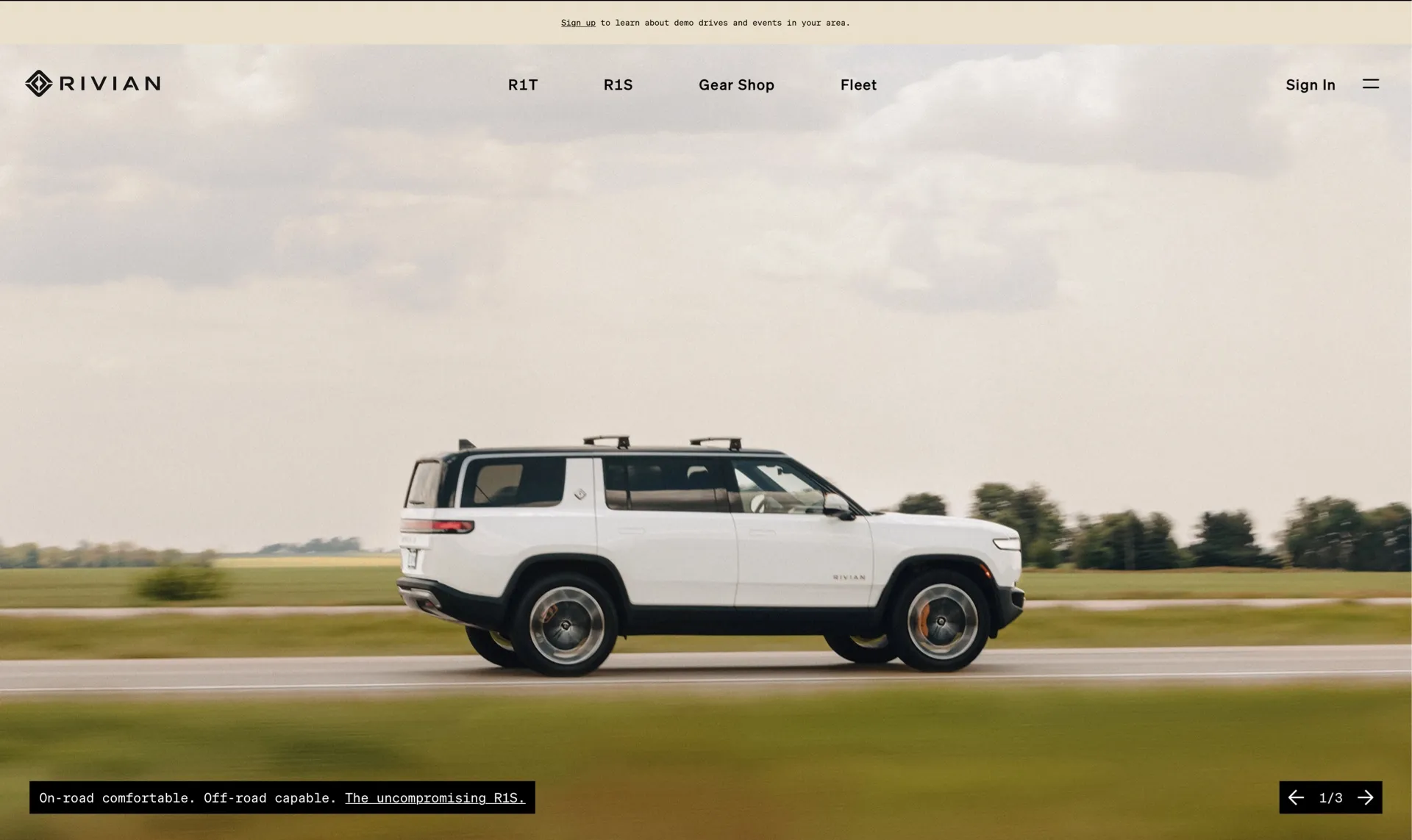
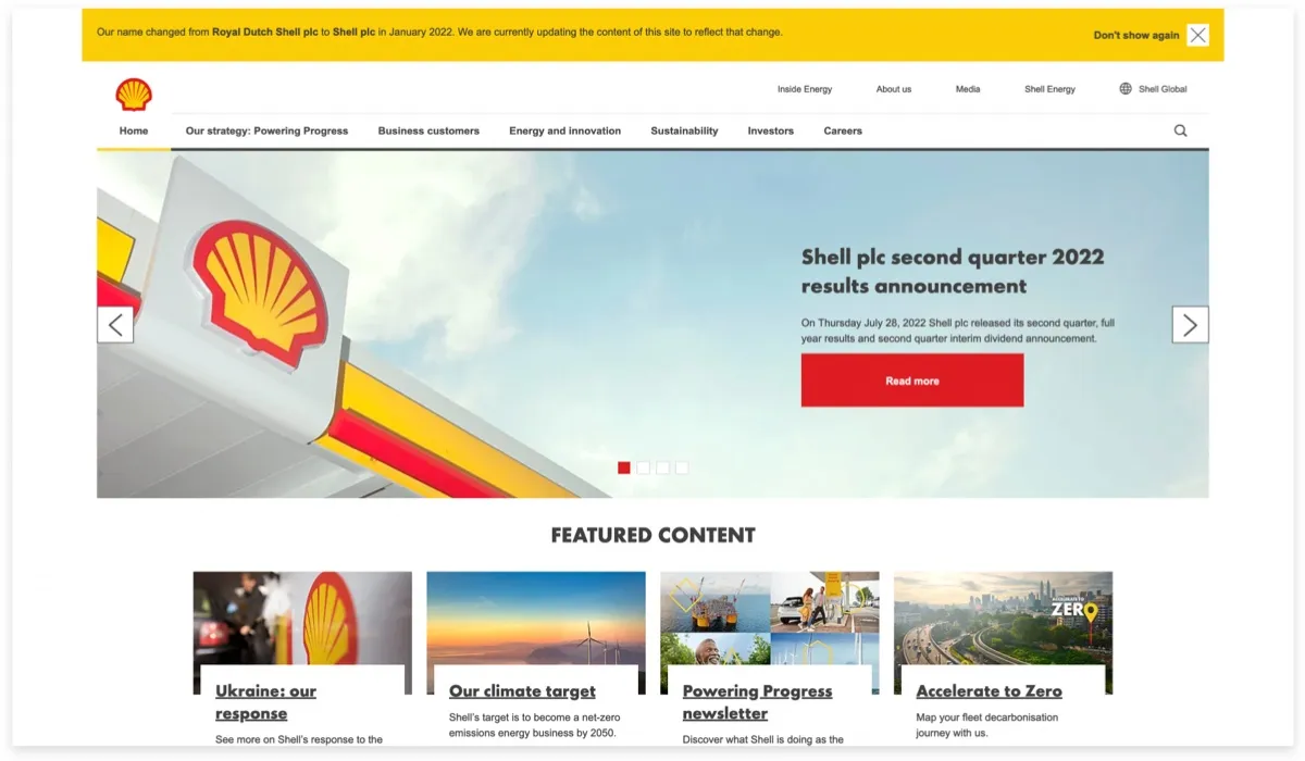
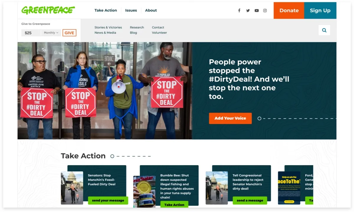
Usually they have a navigation bar at the top with their logo in on the left hand side and links on the right.
If they are a particularly large or complex organization, they might have another navagation bar on top of their normal one, following the same pattern.
Then, a lot of the times there will be an image underneath with big text proclaming a statement.
Next to the text there is usually a call to action button.
This lay out applies to so many websites we see on the internet. Some of the elements might not be in the exact same place, but you get the point.